1Cademy.
1Cademy is an educational platform with a focus on group note taking. It is intended to be used by an entire class or study group where everyone can equally contribute to the network of notes. The design of the program is unique in its web-building visuals. Instead of adding notes in a PDF document, users add bullet points in “nodes” or pods of information that connect to each other. From these nodes, other users can edit, comment, or link ideas together.
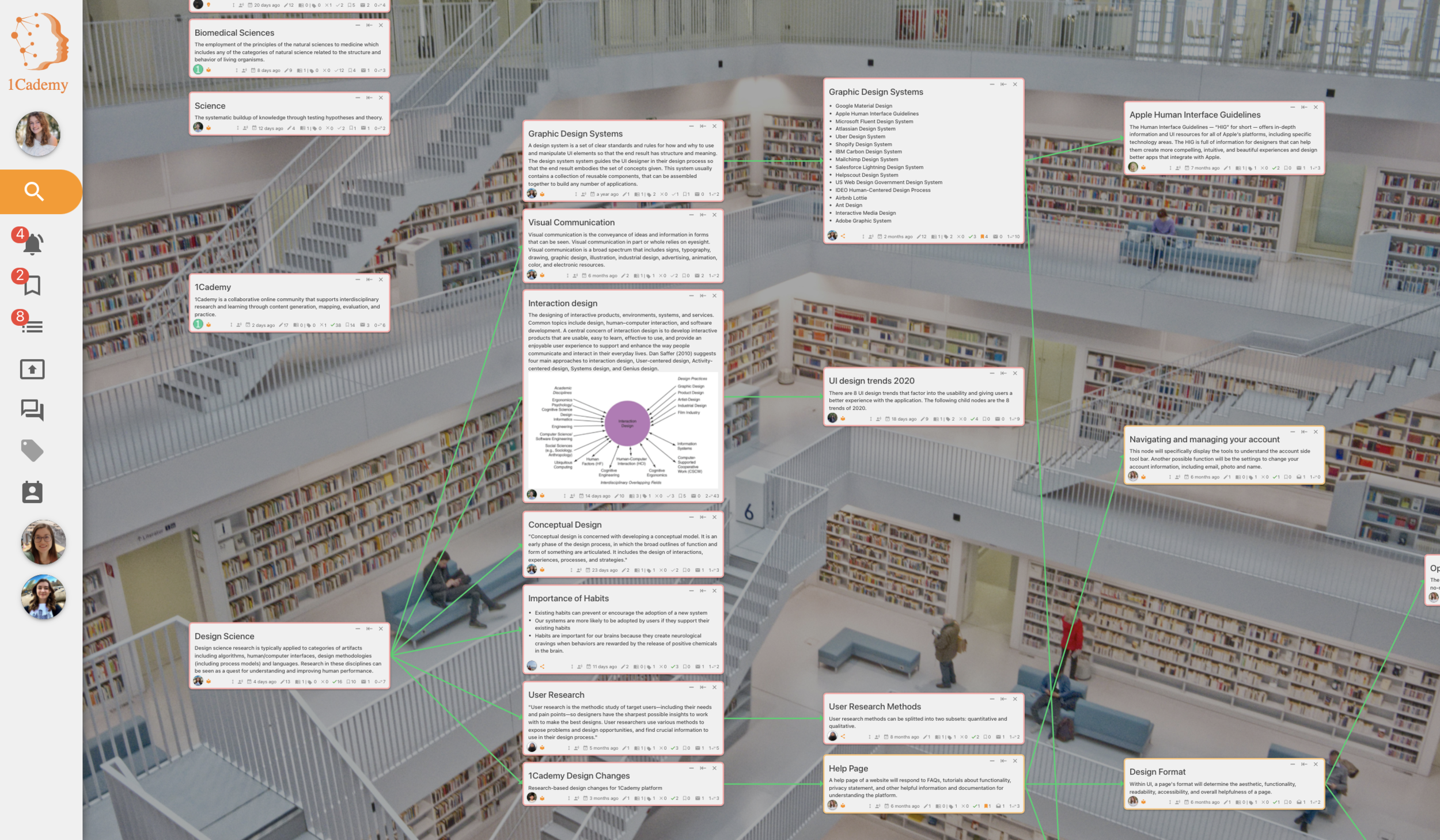
Example of the 1Cademy nodes.
-
Involvement.
UI Design Intern
December 2020 - May 2021
-
Projects.
Style Guide (group)
Full User Profile UI (solo)
-
Tools.
Adobe Photoshop
Figma
Project Goal
I joined 1Cademy in the early stages of the program. Therefore, the internship focused heavily on building a cohesive design that was efficient and user friendly.
Due to the nature of the nodes, the program looked very unique and, because of that, posed a UX challenge: how can I make an unfamiliar style easy to learn and use?
In addition to creating graphics and designs using Figma, much of my internship involved conversations and group discussions for what about the platform could be improved.

Creating a style guide
In order to allow individual projects that pursue a cohesive style, I assisted in creating a design guide. This document allowed for specifying hex colors, fonts families, text size, and more.
Our design centered around the color orange. After speaking to 1Cademy founder and CEO, we determined our goal emotions of the platform were enthusiasm and creativity. After researching marketing psychology and color effects, I decided that these orange tones created the energetic, desired environment while still allowing for an attractive color scheme.
As we developed these font and color guides, I recommended creating a dark mode as well. Dark modes are becoming increasingly popular for its accessibility to sensitive eyes and night-time viewing, so it was important to me that this feature was implemented. Creating both versions of the style guide allowed for cohesive designs from separate teams in both light and dark modes.
User Profile
In addition to the style guide and UX group discussions, I was personally assigned to developing the UI for the user profile.
Background
When I began the project, there was no option to view a user’s profile extensively, only through a side panel with limited information. The goal was to make a larger, full-screen version of this that mimics a social media platform.
Goals
After speaking with other designers and the CEO, my inclusion checklist was:
name
profile picture
activity information
contact information
Design @ start
Seen here is was the condensed user profile that I would work to expand.
I noted that the color scheme was inconsistent (using various orange, greens, and yellows) and the name was not visible.
Each of the graphics and their numbers represent a point-value depending on how many times a user has interacted with a specific feature. I wanted to further dive into these analytics in the my design, showing not only the current statistics but the change over time.
Also, please note the dark to light mode slide that was implemented with my recommendation.

First draft
My first draft entailed the user’s portrait, name, email, and a small graph detailing the proposals-per-day change.
Below is the pinned vs all nodes for the user to reference back to.
I considered this a rough draft, but I was happy with the general layout, use of the color scheme, and information displayed.
Feedback
My feedback from user interviews and other designers included:
more use of analytics
add more color
include more social media-like features

Second draft
Working with my given feedback, I added a customizable biography to imitate the profile of LinkedIn, Instagram, Twitter and other social media sites. I also added a tab of related scholars based on the who the user interacts with the most.
I added in more icons under the contact information to display greater user activity and mimic the side-panel version. These icons have hover status to identify the icon’s meaning.
I also added in a 2 option slide bar to view featured or all work so that the appearance stays clean and minimal.
I additionally added in three graphs, first represented as “# of proposals per day” on each, with plans to demonstrate further data after user interviews requested other information.
More feedback
My second round of user interviews and other designers included:
use the color in a bolder way
keep the biography and related scholars features
for further node analytics, demonstrate the types of posts not just the total number

Final draft
The third, and approved, draft included the recommended feedback + design changes of my own.
I firstly chose to “bold” the color by using a different form of graph: bar and pie instead of line. This worked not only to deepen the color use, but represented the new analytics in a way that was understandable. I expanded the color scheme in order for each pie slice to have a different color.
I lastly chose to use a lighter grey overlay instead of a colored outline to give a clean, minimalistic appearance. I felt that with the greater presence of color in the graphs, the outlined nodes looked too busy.
This feature final draft was approved and implemented into the site.
Diversity, equity and inclusion
DEI is extremely important to me. Each project I do is completed through this lens.
While designing the profile page, the CEO was very persistent about requiring users to use their legal name, much like Facebook in the late 2010s. He wanted 1Cademy to be used for professional and academic use, so he did not want to allow for the possibility of silly or non-serious names.
I was opposed to this idea due to the exclusion of transitioning or non-cis identifying individuals to express themselves freely through the platform. If someone chooses to use their non-legal name, I did not want he/her/them to feel excluded from our platform based on this feature.
I brought up this concept in a meeting with all designers and the CEO himself. In addition to voicing my opinion, I backed up my claims with a short presentation referencing my research of Facebook’s experience requiring full, legal names and the backlash they faced.
At the end of the presentation, all parties had agreed to eliminate this feature.
If I had more time…
I would have been interested in:
prototyping - I was hired as a UI design intern, so I passed my work off to UX designers at this point. I would have been interested to take a stab at the interactions and transitions myself.
further usability testing - only the first and second drafts were tested with users. Once I created the third and final version, the team felt confident to implement. I would have been curious about how this version performed in usability testing.
implement KPIs - this is the first full-view of the user profile. For that reason, there was no former data on how users interacted with it. I would have liked to outline some KPIs for measuring its success (conversion rate, for example).