The Brag House Inc.
I joined the Brag House as they were early on in building their brand. The founders had a strong sense of the community they wanted to build and their target audience of college campuses.
I worked between the marketing and web design team to create this desired effect through UX and market research, graphic design, and social media interaction.
Graphic Design
One of my roles at Brag House was graphic design production for the Brag House-specific social media accounts of the University of Michigan, Michigan State, Ohio State University, and many more. While making graphics for one page, I had to translate the design into others that fit for different schools. This took consideration from colors, cultural relevance and design composition.


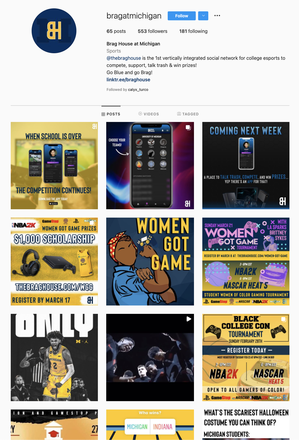
@bragatmichigan
Another role at Brag House was not only creating content for Instagram, but managing the University of Michigan-specific account itself. I worked through a style guide with consistent hex colors, both matching the university standards and creating for a cohesive look across all posts.
I utilized following pushes and related account interaction to grow my following. From the beginning of the account’s creation to the end of my internship, the following had grown from 0 to 500 followers.
The same hex colors and stylistic feel has since continued on the page.
UX: Content Inventory
As I transitioned from the marketing to the UX team, I first began with a content inventory of the website. Because this was a start-up and their website was fairly new, it lacked some crucial, brand-building details.
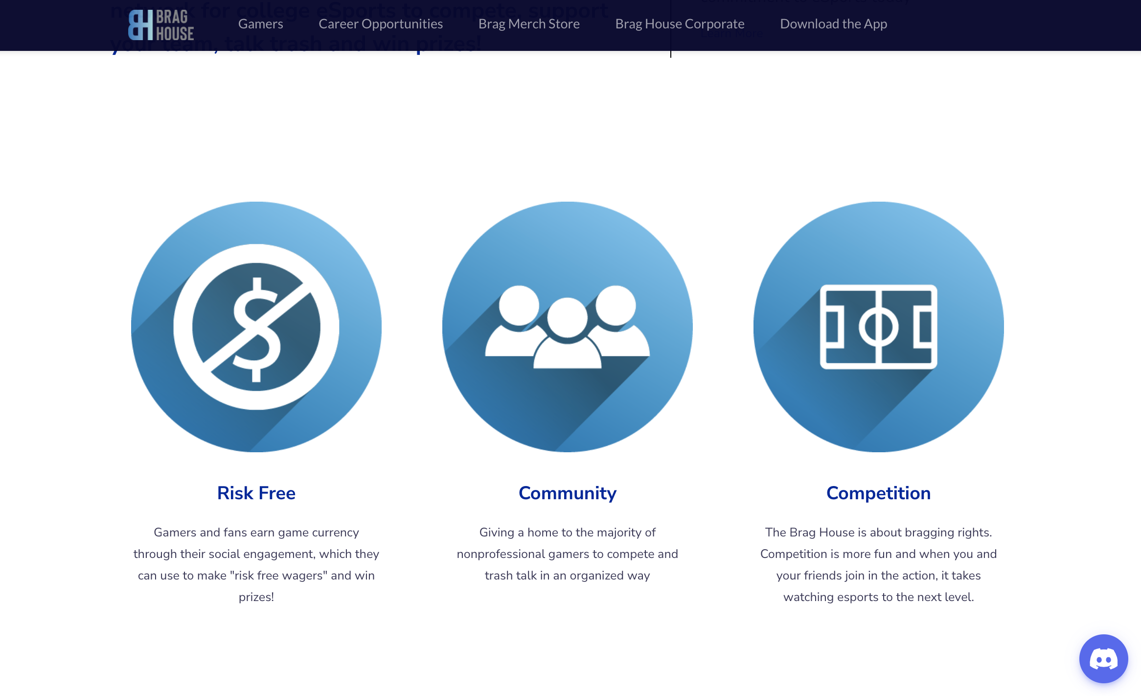
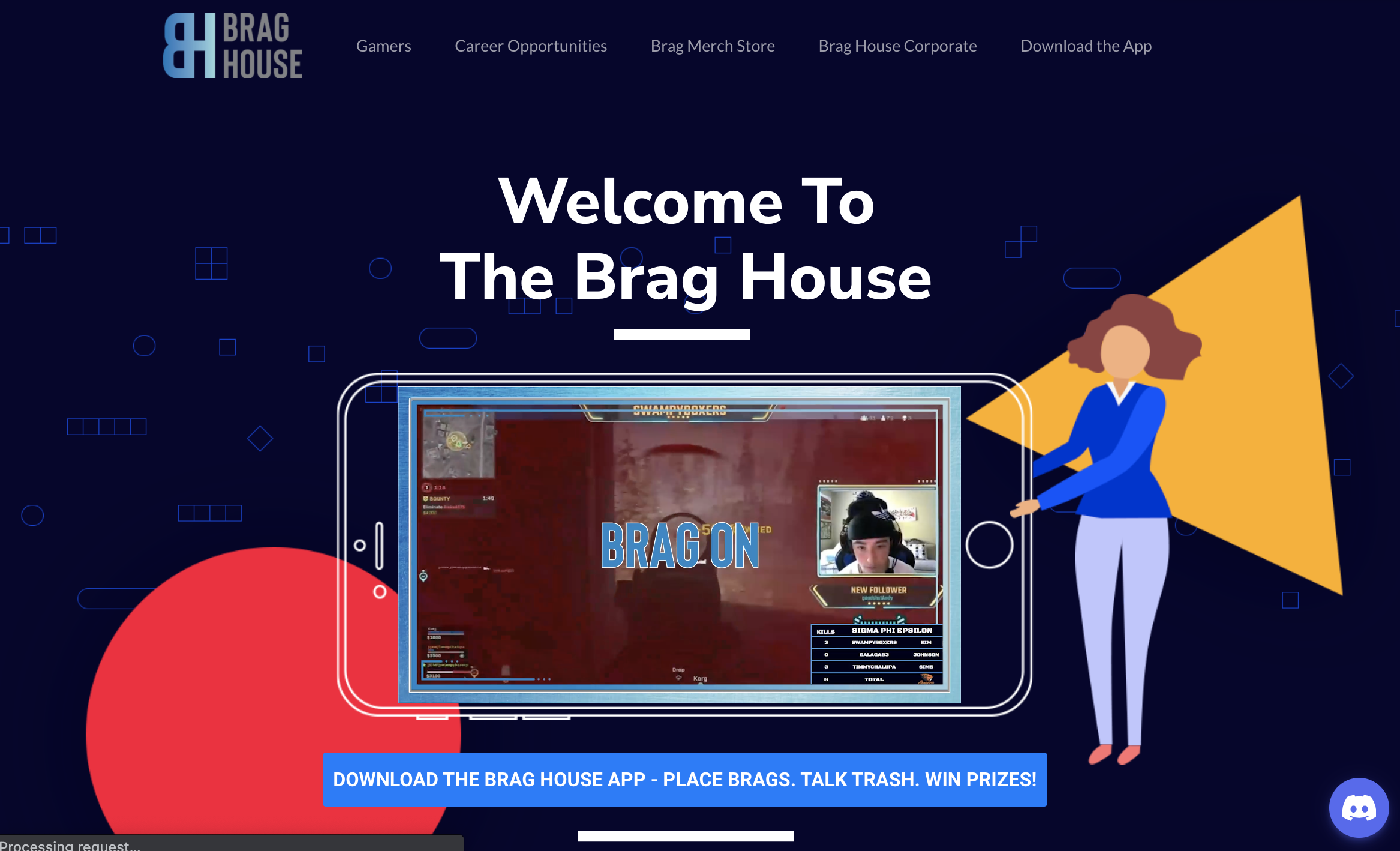
A portion of the current homepage
Although the home page looked great, the website’s content lacked:
about page describing Brag House
definitions of Brag House-specific terms
links to tournaments and events
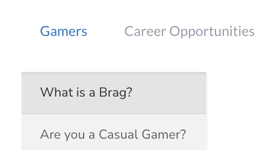
How to access the page from the header.
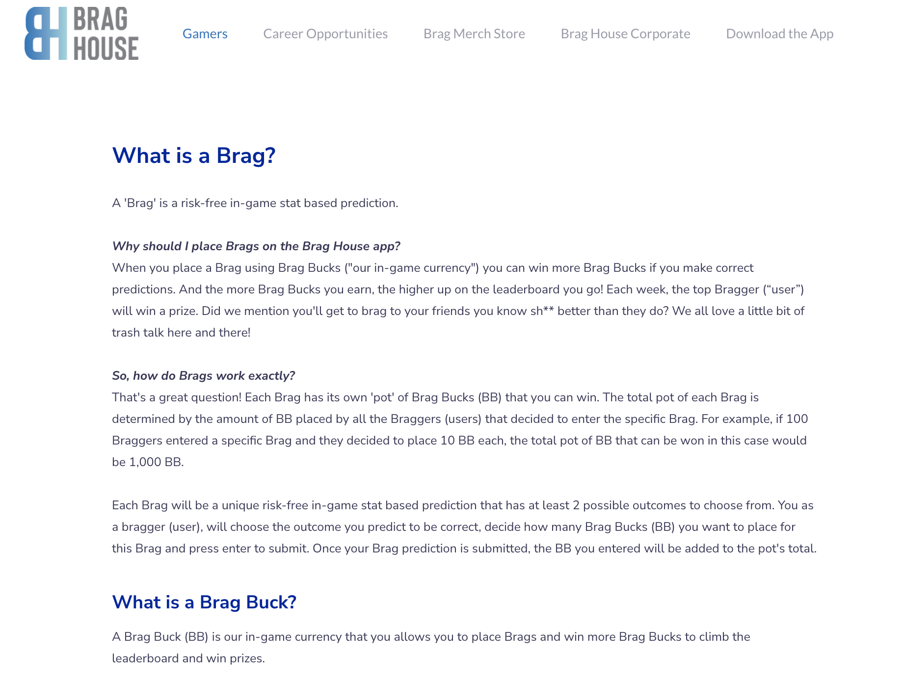
The BH definitions page.
Definitions Page
After attending events and learning about the BH fan base, I noticed that many audience members didn’t understand the language, including “brag” and “brag bucks.” Most of the events had to budget time for defining these terms because the audience was not familiar with the Brag House language.
I worked using UX design and UX writing to co-develop a page that explicitly explains the Brag House language. The definitions came directly from the CEOs and were reformatted to fit the aesthetic of the page.
Using hex colors drawn from the homepage, the section titles reflected the same color scheme. This allowed for a cohesive look across pages.
Because this is its own page, with a unique URL, it allowed for easy sharing. In future online events and Twitch streams, if a term needed to be clarified, it could be followed up by sending the link in the chat, allowing new members to catch up on Brag House vocabulary without using more event time.
User Flow
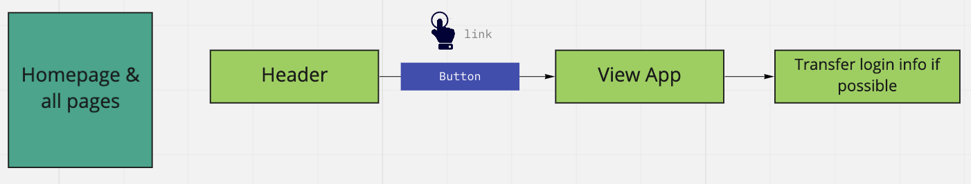
Through a mini-user flow, I recommended a link to the Brag House app through the web platform.
I wanted the app link to be accessible through any page on the site, so I decided the best place for this would be the header. This way, it could be accessed across the entire website.
This change was implemented and still exists on the site.
Homepage
The rest of my time at Brag House was collaborating on the homepage design in a team of three students using Wordpress. We experimented with image overlays, videos, color schemes, and ordering of information, following with user interviews with Brag House team members.
Together, we decided on a navy background to uphold the blue style of their pre-made logo. We also used avatars and animations to create a graphic, video game-like look. The videos added an interactive and engaging element to the page.
The final template we created is still the current homepage of the website.
The app interface was heavily based on the designs of the Brag House web homepage.