Opportunity Hub.
Within Expedia Group Partner Products, we offer a service that allows partners (property owners) to manage their reservations and property details while discovering opportunities for improvement. A key component of this service is the "Opportunity Hub," where users receive tailored suggestions to enhance their property and listing performance across Expedia Group platforms. Our goal is to make the Opportunity Hub more personalized, driving higher adoption and engagement.
-
Involvement.
UX Content Designer/Strategist
November 2023 - February 2024
-
Project.
Maximize the adoptions of the opportunities by providing a personalized and tailored experience.
-
Tools.
Figma
Let’s set the stage
Expedia Group products are split into two areas:
🧑🏻💻️ Traveler-facing products (Expedia.com, Vrbo.com, etc)
🏨 Partner-facing products (internal tools to manage your listed property)
This project—like all my work at EG—lies within partner products.
This project tackles the Opportunity Hub
This is a high-traffic area within partner products for hoteliers and other property owners. Here, partners can learn and take action on opportunities to boost their revenue—through promotions, profile content, rate adjustments, and other recommended actions.

Project Objective
Partners often lack the time, bandwidth, or relevance to act on suggested opportunities effectively. We aim to create a solution that allows partners to control when these opportunities appear based on their own workflow and timing. Additionally, understanding why certain recommendations are overlooked will inform our future tailored, personalized coaching strategies.
The starting place
-
![]()
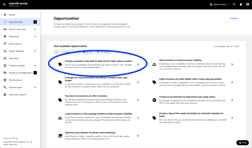
Step 1
Partner selects an opportunity of interest from the grid view.
-
![]()
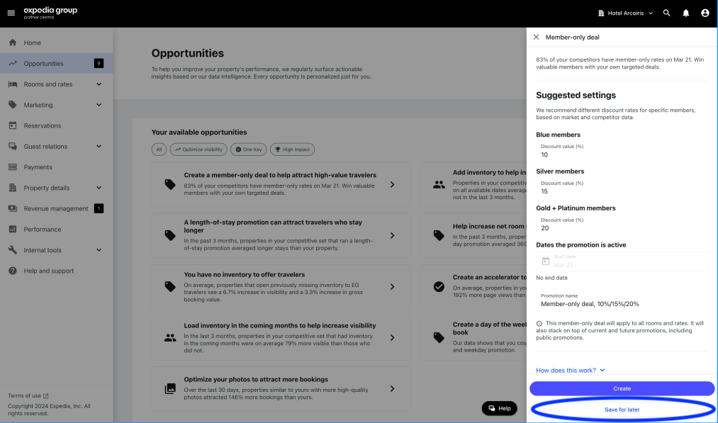
Step 2
A side panel appears detailing the opportunity and the action to take. There are 2 CTAs at the bottom: take the action (primary) OR save for later (secondary). This user chooses ‘Save for later’.
-
![]()
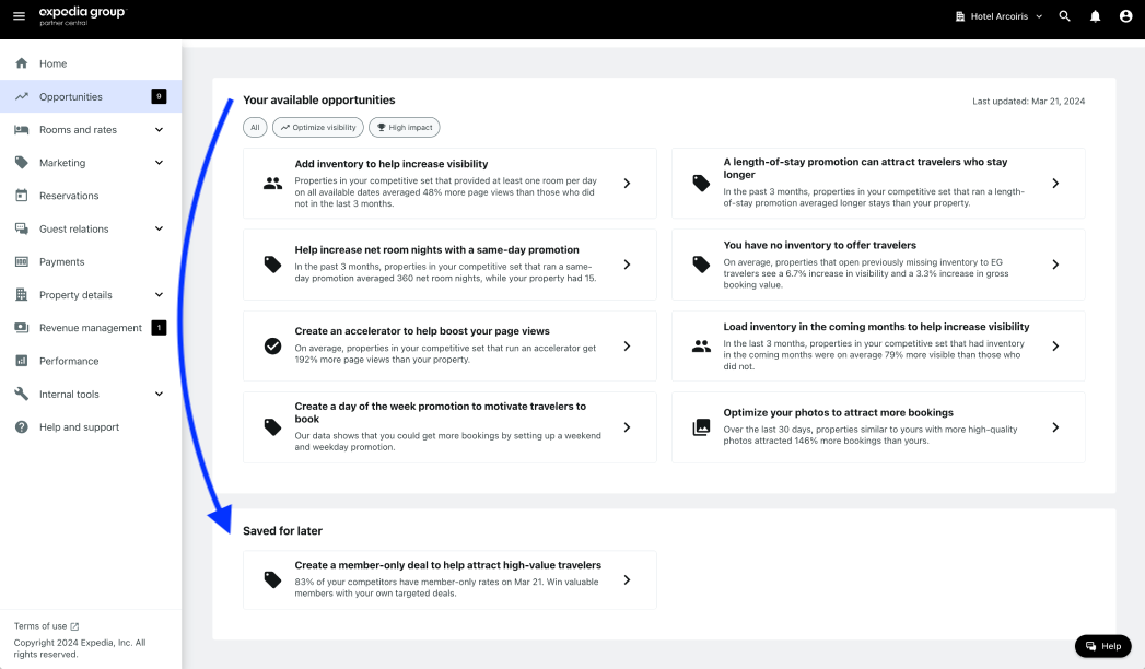
Step 3
The opportunity card moves from ‘Your available opportunities’ to the lower section, ‘Saved for later.’ In 7 days, it would reappear in the main section.
What did I notice?
Now or later approach
My goal was to “allow partners to choose when they see opportunities based on their timing and workflow”.
Their only options were to do it now, or snooze for 7 days, which covers a minimal number of use cases. This offered little control to partners to organize their workspace and prioritize the opportunities most relevant to them.
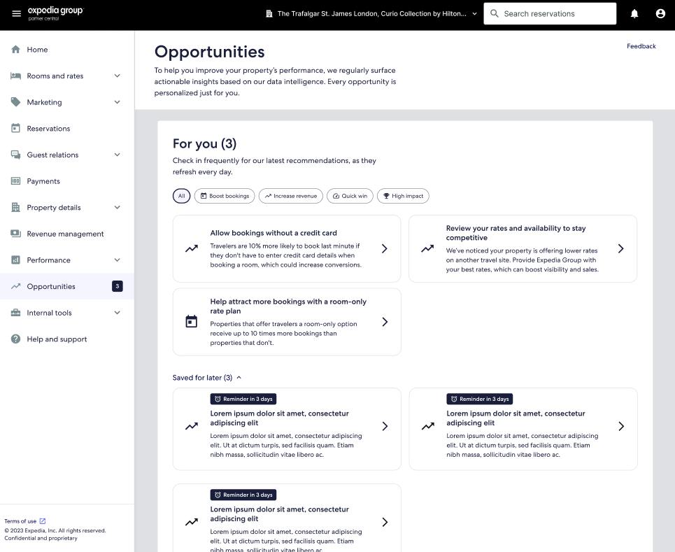
Missed opportunity to learn
The intent of saving for later is unclear.
The report data can’t tell us if partners take action directly in Save for Later or if they wait until the opportunity reappears in the available folder to take action.
Assumption of relevance
Some opportunities within this area are specific to the user and their data. Most are not.
By offering this ‘now or later’ approach, we assume the partner wants to do the action it’s just a matter of when. In fact, some partners may not be interested in our non-personalized recommendations for all partners.
My hypothesis
By creating a solution to organize partners’ opportunities to their unique needs, workflows, and preferences, we aim to :
optimize their decision-making process 🤔
encourage opportunity completion ✅
gain feedback for future coaching strategies 📝
A balancing act
Partners
“As a user of Partner Central, I want to take advantage of opportunities that apply to my property and interest me, considering my personal timeline and workflow.
It’d be easier to do this if I had the capability to clean up the opportunities EG recommended according to my prioritization—choosing when and how I see opportunities so that I’m more likely to follow through on those I intend to complete.”
“I want freedom!”
Expedia Group
“I want to offer opportunities to users that benefit both the properties and the EG corporation. In order to move towards more robust storytelling and rationalization, we need the ability to collect data on user preferences.”
By allowing opportunity customization for users, we can understand why certain recommendations are overlooked, which will inform proactive coaching strategies in other channels. Our long-term goal is to provide a personalized experience.
“I want data!”
The shopping approach
I made sense of this project by comparing it to shopping for clothes. Sometimes, you see something that’s exactly what you need and are quick to purchase it. Other times, you want to think about it, get a second opinion, or completely disregard it. This mental model was replicated through the options for partners and their oppies:
Postpone (put it on hold)
Share (phone a friend)
Dismiss this opportunity (put an item back)
Dismiss any like this (avoid this section)

Like this!

Gathering inspiration
place items in buckets
customized naming
users can see all posts in a feed or in their designated buckets
Youtube
one button appears a full menu, which allows many choices for like, dislike, give feedback, etc


Gmail
emails can be starred or favorited
archived is still findable, and emails can be moved out of archived
customized bucket naming
Tiktok
drag and assign to a unique bucket, or generally ‘flag’ or ‘like’
can indicate no interest in this type of post, confirmed with a toast message


Notion
drag and drop organization
customized naming

Patterns to include
Miniflow within a pop-over
Many of these flows include a small button (like a hamburger menu) that leads to a pop-over with many choices
Keep archived within reach
Nothing is permanent! Everything can be found once again, it’s just out of immediate view if it’s disliked
North Star flows
*
North Star flows *
A path for every user
The design I landed on used a choose-your-own adventure approach. Users woul;d tasp on one, hamburger-style button to see the pop-over. From there, they could choose any of the following options.
Each option would lead to another side panel within the mini flow to collect details and feedback. Looking back at our product requirements, this covers all the asks:
✅ Optional feedback collection
✅ Paths for share, postpone, and dismiss
✅ Customization for partners, data for EG

Let’s see how it works
Below are the flows for four options (share, snooze, dismiss, and dismiss type). The image shows the side panel or pop-over that will display following any button.

Share 📮

Postpone ⏰️

Dismiss ❌

Dismiss type 🚫

Built-in Insights
Forms are valuable, but we can’t expect users to always complete them. Our partners are busy, so I didn’t want to rely solely on an optional feedback form to gather insights.
When I first started this project, the only "not now" option was Save for Later, which told us nothing about user intent—whether they planned to return, weren’t interested, or would never engage at all.
Now, users can express their intent directly through the button and path they choose. This built-in interaction provides far more insight into their decision-making than ever before. Feedback forms are still encouraged for added context, but the core understanding of user intent is already captured through the multi-directional flow itself.
What does ‘postpone’ mean to users?
The side panel was complete, but that was just one piece of the puzzle. We also needed to determine where these opportunities would live once partners organized them. To complete this project, we had to consider the full-page experience.
Through this, we uncovered two key mental models users might have when postponing a task:
Prioritized to-do list
“I want to do this, but not right now. Keep it in a visible, highlighted space and remind me so I don’t forget—I plan to revisit it soon.”
Clean it up
““I might do this, but I’m not sure yet. Tuck it away for now and remind me later so I can focus on immediate priorities.”


Hierarchy explorations
Based on the two above mental models, we had to consider how the saved for later (yellow) vs the regular feed (pink) vs the dismissed oppies (green) would appear together

The chosen layout
After a throrough review with colleagues and research, the shown layout was chosen.
The ‘clean it up’ approach
This follows mental model #2, which was widely agreed upon by partners during user research. They would prefer to move the opportunity to a less visible, collapsable area to focus on others who don’t require time to think.
Countdown badges
When postponing an opportunity, users can choose when they’d like to be reminded. That countdown will be visible on the badge so that users can
Dismissed = no reminder
We want to keep all opportunities visible. So, instead of a separate ‘dismiss’ function, users can choose to postpone something indefinitely. Then, it’d live in the ‘Saved for later’ area where it can always be found again.
Tackling challenges

🌧 We can’t predict when oppies will expire

Opportunities are refreshed frequently, so they may change or expire due to market conditions.
☔ But, we can set expectations that opportunities can expire through content
🌧 We can’t permanently delete anything

With market changes, opportunities will refresh every 74 days. So, everything should stay visible to allow for potential interest in another version of that opportunity.
☔ Keep all opportunities discoverable
🌧 Dismiss and share are out of scope for this version

The goal is to get something out first, collect more data, then iterate. All of the current reasons in the feedback form was pulled from prior research.
☔ Focus on postpone and collecting optional feedback

See it live
As mentioned, we faced a few constraints that prevented us from immediately shipping the design—primarily limited development time. To navigate this, we collaborated with developers to craft a version that retained the key features while ensuring a quick and efficient launch.
The designers were fit for both the desktop and app.
What’s next for the opportunity hub?
📝
Gain feedback from partners
As users engage with this feature, through their actions alone or through optional feedback forms, we’ll gain insight into their motivations.
🏋🏽
Train the recommendation algorithm
As partners avoid certain opportunities in the future, we can learn what they like and dislike to serve them better opportunities they’ll be more likely to take.
⭐️
Incorporate North Star designs with revisions
For now, the design is running with only the postpone functionality. Eventually, we hope to return to the north star flow seen above.
🌀
Continue to iterate and improve
Like any project, we don’t know yet what we don’t know. There may be surprises or new insights as we watch users engage with this new feature, and from that may be new learnings and projects.